Branding, Packaging Design, Visual Identity
Bonavista Coffee Company—Identity Design
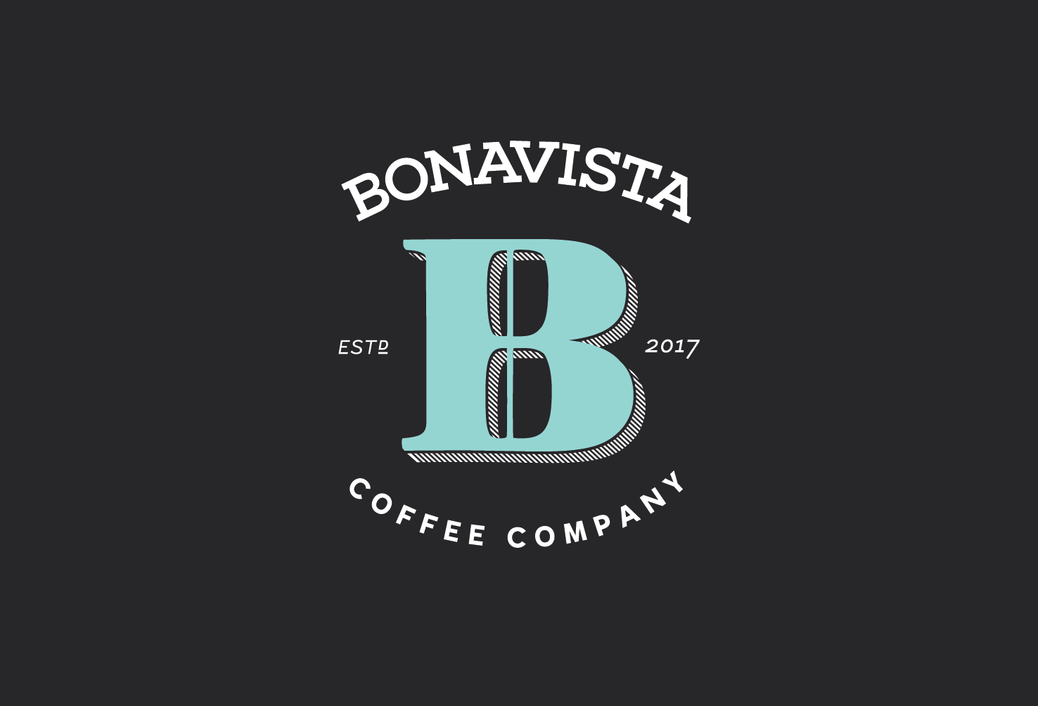
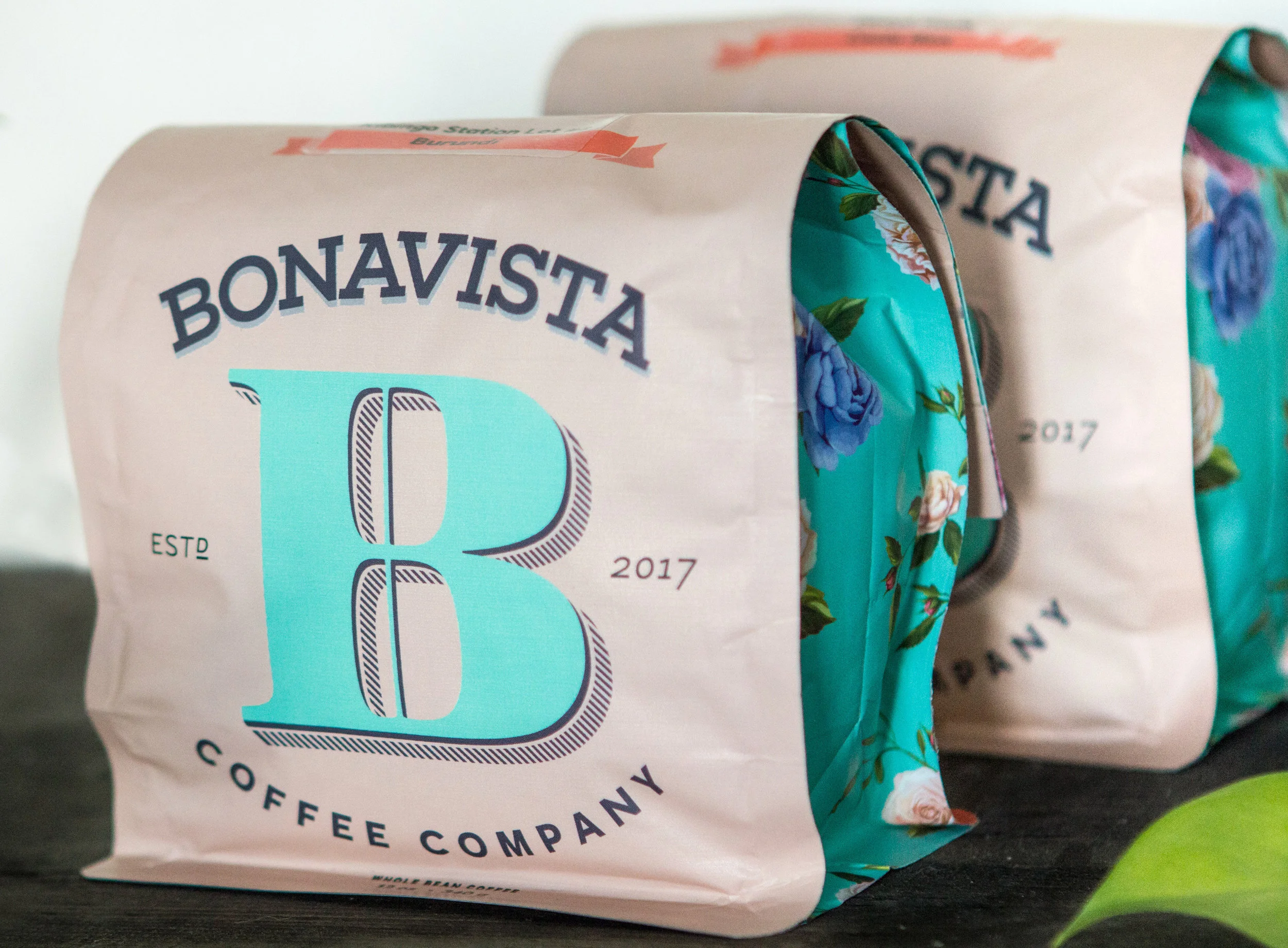
Bonavista Coffee Company is a micro coffee roaster based in Newfoundland with an amazing mission to become totally Direct Trade. Owner Jon Howse travels to coffee producing countries to meet with farmers and pay higher prices for better farming practices and higher quality coffee.
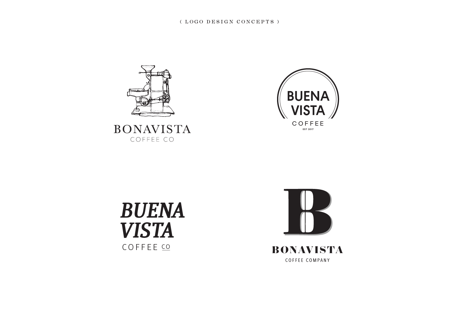
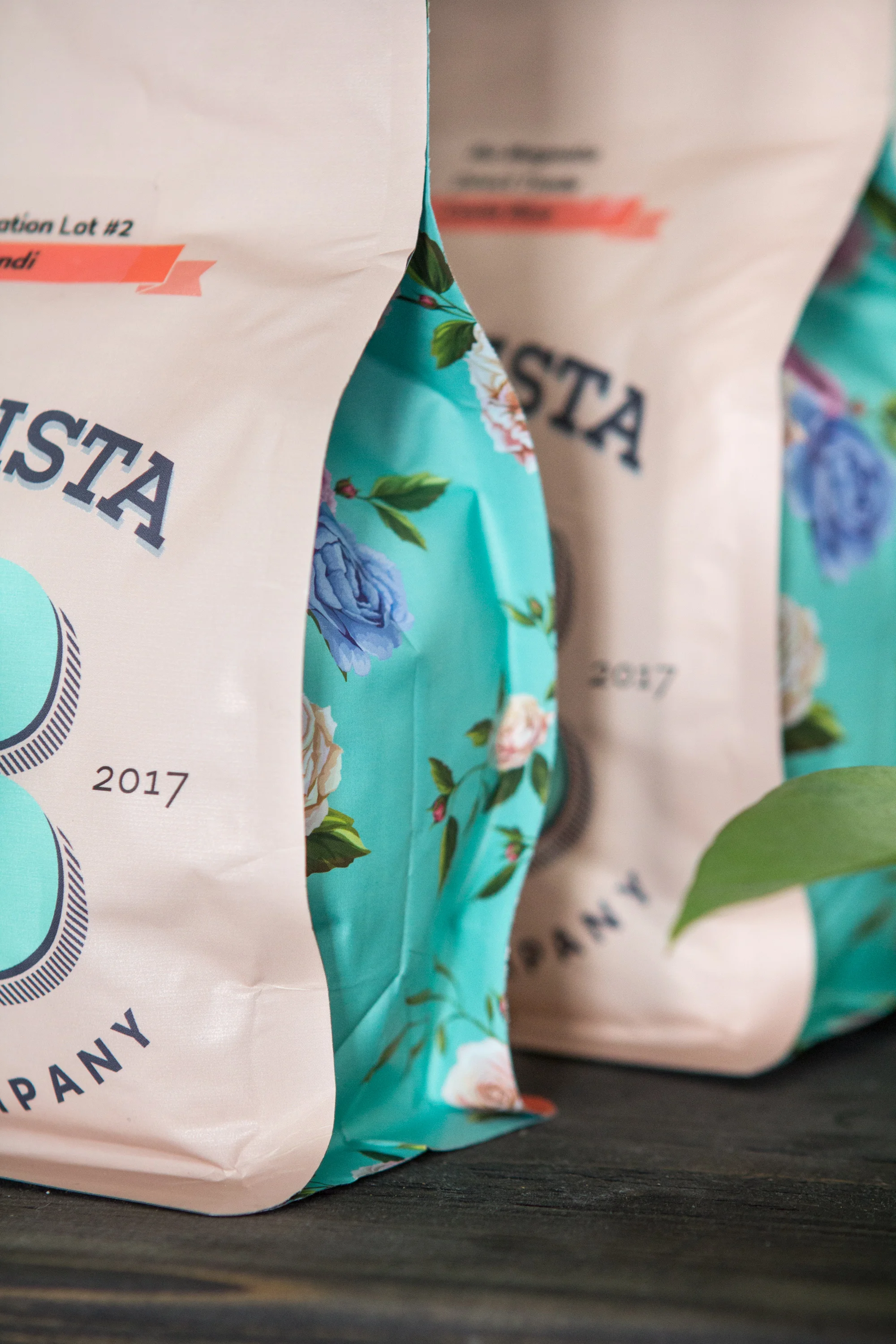
The visual identity reflects the forward-thinking nature of the company with simple pastel colours. The strong history of early European explorers and cartography is emphasized by the giant “B” monogram. This is contrasted by two modern typefaces: a post-geometric sans Halcyon brings a bold, modern look; and a strong slab-serif Artegra Slab emphasizes the hard-working nature of the small community of Bonavista. Layout and hierarchy bring the farmer and place of origin to the forefront, with extensive information on the back for the curious customer or coffee connoisseur.